‘Mapping Choices’ Launched to Visualize Carbon Choices
In conjunction with new peer-reviewed scientific research led by Climate Central in collaboration with Anders Levermann of the Potsdam Institute of Climate Impact Research, and published Monday in the Proceedings of the National Academy of Sciences, Climate Central has launched Mapping Choices, an interactive online map that allows anyone to visually compare the long-term consequences that different carbon choices could lock in. Our goal is to offer a new way to essentially see the future, for every coastal city and ZIP code in the US, and better understand what different emissions or warming levels ultimately mean. The sea level rise we map may take centuries to play out, but we set it in motion today.
Mapping Choices represents a major new addition to Climate Central’s existing suite of sea level tools, including the Risk Zone Map, which delineates 21st-century sea level and coastal flood threats, and the Risk Finder, which provides local sea level and flood risk projections and exposure analysis. We will be extending Mapping Choices and the Risk Zone Map from U.S. to global coverage in November 2015, providing what we believe will be the first high-resolution, online, comprehensive global views of near-term and long-term sea level risks. You can sign up for email announcements at the bottom of our homepage.
To view Surging Seas: Mapping Choices, click here.
To view the related, also embeddable timeline interactive, "U.S. cities we could lose to the sea", click here.
To view the related, also embeddable photorealistic scenes of iconic U.S. locations, click here.
Summary of findings
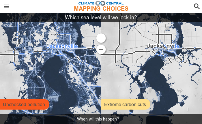
Our research indicates that unabated carbon emissions through 2100 could lock in 14 to 33 feet of long-term global sea level rise. Such rise would threaten to submerge land currently home to 20 to 31 million Americans, including the majority of residents in more than 1,100 municipalities and in more than 20 cities with at least six-digit populations.
Extreme carbon cuts could decrease these threats by more than half, reducing the damage inflicted on many iconic American cities and landmarks. In Florida alone, such cuts could prevent the submergence of land now home to 5.6 million people. However, the emissions reductions required for this degree of benefit are far deeper than would be achieved from current U.S. and worldwide national pledges ahead of global climate talks scheduled for December in Paris. The required cuts are instead consistent with peaking global emissions by 2020, followed by a 50-year drop to near zero.
These are a few of the headlines from the Climate Central-led paper behind these maps. The Supporting Information section at the end of the downloadable paper includes 12 tables with detailed and extensive results for each coastal state and the cities with populations exceeding 100,000 most affected.
Compare many scenarios
The sea level locked in depends on the total amount of carbon that reaches the atmosphere. Mapping Choices lets you compare local implications from a range of possible scenarios, including historical pollution, unchecked pollution, and minor, moderate, or extreme carbon cuts; as well as fixed warming levels of 2.7 °F (1.5 °C), 3.6 °F (2 °C), 5.4 °F (3 °C), or 7.2 °F (4 °C).
The science behind the map
Carbon pollution casts a long shadow. It is expected to persist in the atmosphere long enough to prolong temperature increases for hundreds and thousands of years, long after we stop burning fossil fuels or clearing forests. Our research first translates cumulative carbon emissions into locked-in long-term global temperature increases, and then translates these into locked-in sea level rise projections.
The sea level projections are based on four separate models for the expansion of ocean water as it warms; melting glaciers; and the decay of Greenland and Antarctic ice sheets. We develop local projections that can vary by several feet from the global average based mainly on changing gravity fields as the polar ice sheets lose mass. (Local projections shown do not factor in the continuation of current land subsidence or uplift. In most places, these might translate to inches per century, but some places, such as southeastern Louisiana, are sinking closer to one foot per century.)
Some research has suggested that the West Antarctic Ice Sheet has begun an unstoppable collapse, but the evidence is far from conclusive. The maps here do not assume inevitable West Antarctic collapse. If collapse has in fact begun, all locked-in sea levels would be higher than shown. Carbon emissions levels would still influence all outcomes. These scenarios are detailed in the PNAS paper.
This effort is made possible thanks to the many organizations that have supported the sea level program at Climate Central, including the Kresge and Schmidt Family Foundations. Map development was also supported in part by U.S. National Science Foundation grant ARC-1203415. We also appreciate Stamen Design, the interactive mapping experts with whom we have worked closely from the very start of all of our sea level mapping.
For more information please contact Dan Rizza at drizza@climatecentral.org.