New Slideshows - Compare Risk
In the Comparison section, view heat maps of sea level rise & flood exposure, by topic.
Note: The analyses contained on this website should not be taken as precise predictions or flood emergency guides. Rather, we present them as risk indicators in a world of rising sea levels and increasing floods.
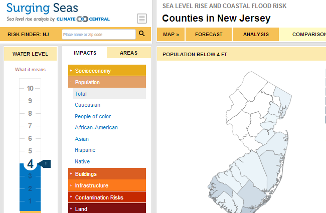
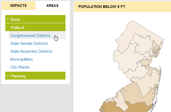
Analysis is grouped by area type. Click the "Areas" tab to select a boundary type that will divide up the state.
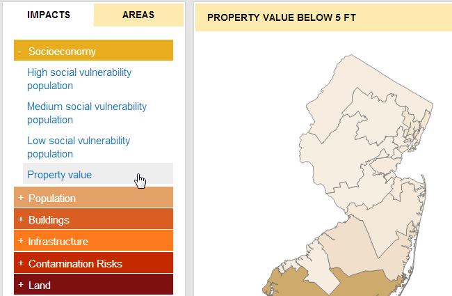
Next, click the "Impacts" tab to select an impact type to be displayed on the map.
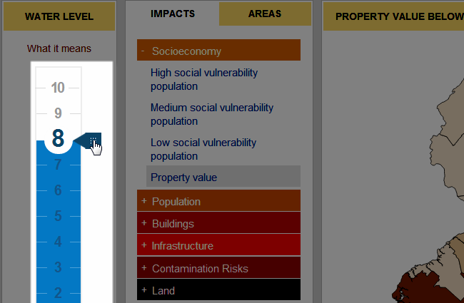
Next, adjust the water level by moving the slider up or down. You will notice the shades of the various sections of the heat map change dynamically.
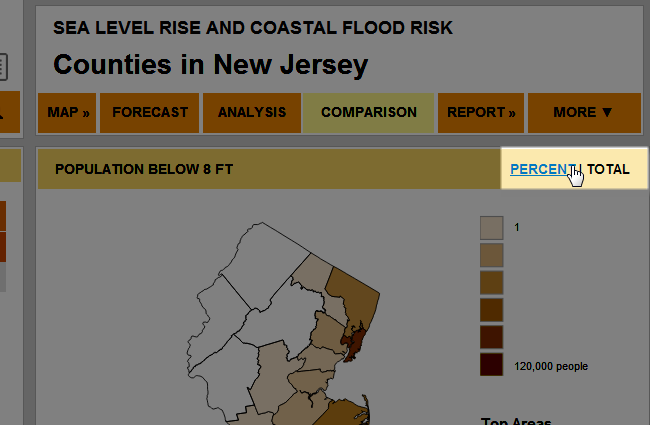
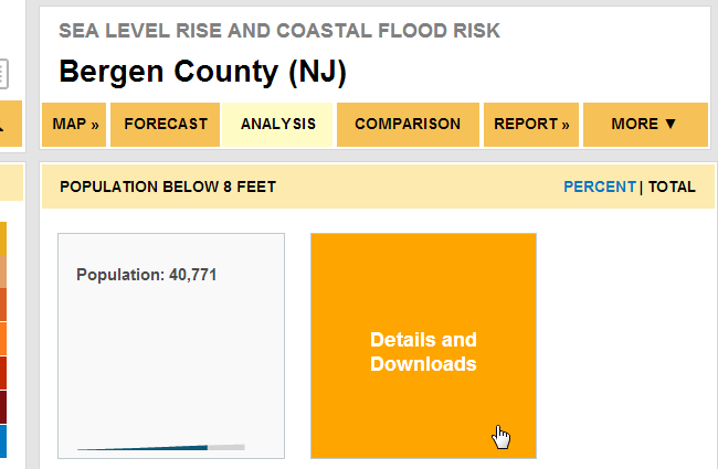
The heat map can be viewed by Percent or Total.
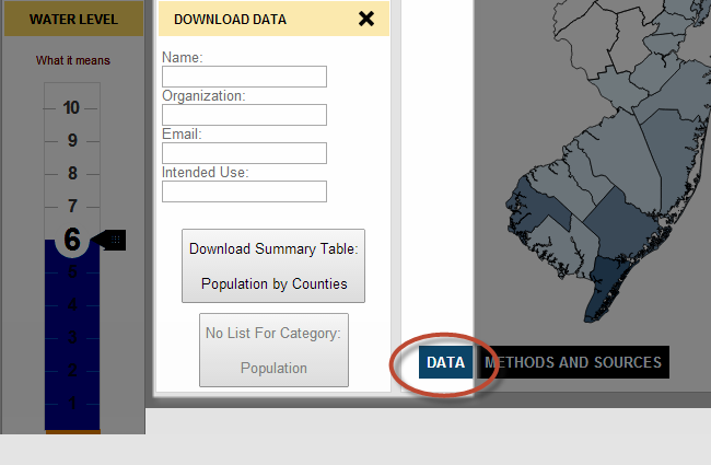
Click the "Data" button to fill in the form to download the data used to build that particular map.
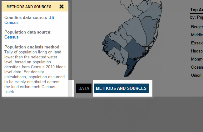
Click the "Methods and Sources" button to view raw data sources and analysis methods.
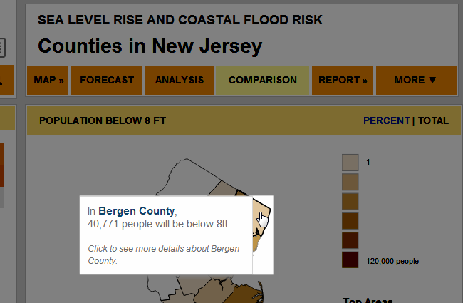
Hover your mouse over any particular section of the heat map to view details.
Click on a section of the map to see data analysis tiles for that particular administrative area.